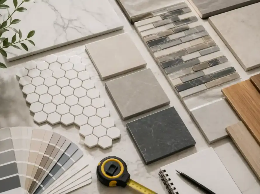
Matching floor tile with wall tile can completely change the appearance of a room. The right combination creates visual balance, while poorly coordinated surfaces can make the space feel crowded or disconnected. Fortunately, matching tiles doesn’t mean choosing identical products.
Color, undertones, tile size, texture, finish, patterns, and lighting all influence the final appearance. Room size and practical requirements matter too. By considering these details together, you can create a tile design that feels natural, comfortable, and well planned.
Start With the Floor Tile
Floor tile usually covers a large area, making it an important part of the overall design. For this reason, it’s often easier to choose the flooring first and select wall tile afterward. The floor provides a foundation for everything else.
Look closely at the floor tile before choosing complementary wall materials. Identify its dominant color, secondary shades, texture, and overall style. A beige tile, for example, may contain cream, brown, gray, or golden tones.
These subtle variations can help you find suitable wall tile colors. When selecting both surfaces together, collect several samples and place them side by side. Comparing actual materials gives you a clearer idea of how they work together.
Match the Undertones
Matching undertones is one of the most useful principles when coordinating tiles. Two tiles can appear similar at first glance but still have different undertones. Those differences can become much more noticeable after installation and under room lighting.
Warm floor tiles commonly feature beige, cream, tan, brown, or earthy tones. They usually pair naturally with warm white, ivory, sandstone, and similar wall colors. These combinations create a comfortable appearance without excessive contrast.
Cool tiles often include gray, blue, crisp white, or greenish undertones. They can work well with cool white, charcoal, slate, and muted blue wall tiles. Choosing similar undertones helps prevent the surfaces from looking visually disconnected.
Consider Warm, Cool, and Neutral Tones
Greige tiles provide additional flexibility because they combine characteristics of beige and gray. However, they can still lean warmer or cooler depending on their exact color. Always compare physical samples before making your final selection.
If you’re unsure about undertones, compare the tile against plain white paper. Subtle color differences become easier to notice against a neutral background. This simple test can help narrow down compatible wall tile options.
Choose Matching or Contrasting Colors
Floor and wall tiles don’t have to be exactly the same color. Using different shades from one color family can create depth while maintaining a cohesive appearance. This approach works especially well in bathrooms, kitchens, and other tiled areas.
For example, medium beige flooring can work with light cream wall tile. The colors remain connected without making every surface look identical. A darker floor can also provide a strong foundation beneath lighter walls.
Contrast can create a more dramatic appearance when used carefully. Dark floor tiles paired with light walls can make the flooring feel grounded. Meanwhile, lighter wall surfaces can help smaller rooms appear brighter and more spacious.
Add an Accent Wall Carefully
An accent wall can introduce pattern, texture, or color without overwhelming the entire room. Choose a decorative tile that shares at least one color with the surrounding floor or wall surfaces.
Marble-look, geometric, textured, and subtle patterned tiles can work well. When the accent surface has strong visual detail, keep nearby tiles relatively simple. This creates a clear focal point without making the room feel chaotic.
Consider Tile Size and Proportion
Tile size affects the way a room looks and feels. Large floor tiles can reduce the number of grout lines across broad surfaces. This often creates a cleaner appearance and can make rooms seem more spacious.
Common floor formats include 600×600 mm and 600×1200 mm tiles. Wall surfaces may use 300×600 mm tiles or other rectangular formats. Different sizes can work together, provided their proportions feel intentional within the overall layout.
Extremely different tile sizes can sometimes make compact spaces appear visually busy. Consider the dimensions of the room before selecting formats. The goal should be creating balance rather than using different sizes simply for variety.
Think About Tile Layout
The direction of rectangular wall tile can also influence the appearance of a room. Horizontal installation may make walls feel wider, while vertical installation can draw attention toward the ceiling.
Large-format floor tiles can provide a more continuous appearance with fewer grout lines. Smaller tiles may add detail around selected areas or decorative surfaces. Choose the layout according to the room’s proportions and design goals.
Coordinate Texture and Finish
Tile finish affects how light interacts with the surface. Common choices include matte, polished, glossy, satin, and textured finishes. Combining finishes can create contrast, but too many competing surfaces may make the room feel unsettled.
Flooring should balance appearance with practical performance. Matte or textured surfaces may provide useful traction for suitable applications. Always review the manufacturer’s specifications before choosing floor tile for areas exposed to water or frequent foot traffic.
Wall tile offers greater flexibility because it doesn’t experience the same level of wear. Glossy surfaces can reflect light and create a brighter appearance. Matte wall tiles generally provide a softer and quieter visual effect.
Combine Finishes With Restraint
A matte floor with glossy wall tile can create attractive contrast. The difference in reflection adds dimension without requiring additional colors or patterns. However, the finishes should still share a clear relationship through color or style.
Avoid using too many strong textures within one small room. A textured floor, heavily patterned wall, glossy accent, and decorative grout may compete for attention. Simpler combinations usually create a more comfortable visual result.
Use Patterns Without Overwhelming the Room
Patterned tile can become an important design feature. When one surface has a strong pattern, surrounding surfaces should usually remain simpler. This allows the patterned area to stand out without competing with everything else.
A bold geometric floor can work well with plain wall tile. Similarly, a decorative shower wall can pair with simple flooring. This balance keeps the room visually organized while still allowing personality.
Patterns don’t always involve dramatic shapes or bright colors. Natural stone variation, marble veining, and subtle geometric details can also create movement. These details can add character while maintaining a relatively calm tile design.
Balance Bold and Simple Surfaces
A simple rule is to let one surface become the main visual feature. The other surfaces can support it through coordinated colors, textures, or finishes. This approach makes the overall design easier to manage.
Some combinations worth considering include:
- Bold floor tile with simple wall tile
- Neutral flooring with patterned wall tile
- Textured flooring with smooth wall tile
- Plain floor tile with a decorative accent wall
- Dark flooring with lighter, understated wall surfaces
Match Floor and Wall Tile in Bathrooms
Bathrooms contain several visible tiled surfaces, so coordination becomes especially important. The floor, shower walls, vanity area, and backsplash should feel connected rather than appearing like separate design decisions.
A limited color palette can make bathroom tile combinations look more cohesive. Medium greige flooring with light cream wall tile creates a neutral foundation. A subtle marble-look shower wall can then introduce additional visual interest.
Tile Ideas for Small Bathrooms
Small bathrooms often benefit from lighter wall colors and controlled patterns. Too many dark surfaces or strong designs can make limited space feel visually crowded.
Consider using large or medium-sized flooring with simple wall tile. Light walls can reflect more available light, while a slightly darker floor provides definition. Similar colors can also create a more continuous appearance.
Tile Ideas for Larger Bathrooms
Larger bathrooms provide more opportunities for decorative surfaces and stronger contrasts. You can experiment with accent walls, larger formats, different layouts, and more noticeable patterns.
Even in larger rooms, repeating colors helps maintain consistency. Consider using a color from the floor within the shower wall or vanity area. Small repeated details can connect separate surfaces naturally.
Match Tiles With Kitchen Design
Kitchen tile selection should consider cabinets, countertops, appliances, and other permanent features. Floor and wall tile shouldn’t compete with materials that already contain strong colors, patterns, or textures.
If your cabinets have prominent wood grain, neutral tile can provide balance. If the cabinetry and countertops are simple, patterned wall tile can introduce more visual character without overwhelming the space.
The backsplash deserves particular attention because it sits close to countertops and cabinets. Its color should complement both surfaces. Grout color should also be considered because it can either blend with the tile or emphasize individual shapes.
Consider Lighting Before Choosing Tile
Lighting can significantly change the appearance of tile colors and finishes. Natural daylight may reveal undertones that aren’t obvious under showroom lighting. Artificial bulbs can also make colors appear warmer, cooler, lighter, or darker.
Always compare floor and wall samples inside the actual room. Check them during daylight and under the artificial lighting normally used there. This gives you a more realistic understanding of the finished tile combination.
Dark tiles can absorb considerable light, particularly in rooms with limited windows. Lighter wall tile can help balance darker flooring and prevent the room from feeling overly enclosed.
Glossy wall tile can reflect available light around smaller spaces. However, strong reflections may not suit every interior style. Consider the amount and direction of light before choosing highly reflective surfaces.
Don’t Forget Grout Color
Grout is a small detail, but it can have a noticeable effect on tile design. Its color can either blend the surface together or make individual tiles stand out more clearly.
Matching grout closely to the tile creates a continuous appearance. Contrasting grout emphasizes the shape and arrangement of individual tiles. The better choice depends on the style and pattern you’re trying to create.
Choose Grout Based on Tile Style
For patterned flooring, grout that closely matches the tile can reduce visual distraction. With simple rectangular wall tile, contrasting grout can emphasize the layout and make the installation pattern more noticeable.
Think of grout as part of the complete design rather than an afterthought. The right grout color should support the relationship between floor tile, wall tile, and the rest of the room.
Keep the Color Palette Simple
A successful tile design doesn’t require many different colors. Two or three coordinated shades can create enough contrast and depth without making the room feel overly complicated.
Neutral colors such as beige, cream, white, gray, greige, and earthy tones are flexible choices. They can work with many interior styles and allow furniture, fixtures, and accessories to change over time.
If you want a stronger color, introduce it through one carefully selected feature. A blue accent wall can work with neutral flooring, for example. Repeating small amounts of blue elsewhere can strengthen the visual connection.
Common Tile Matching Mistakes
Some tile combinations fail because individual materials were selected without comparing them together. A tile may look attractive on its own but clash with another surface once both are installed.
Mistakes to Avoid
- Choosing floor and wall tile without comparing physical samples
- Ignoring warm and cool undertones
- Combining too many bold patterns
- Using unsuitable flooring for wet or high-traffic areas
- Forgetting how grout color affects the final appearance
- Ignoring natural and artificial lighting
- Mixing too many finishes within a small space
- Selecting tile sizes without considering room proportions
Taking time to compare samples can prevent many of these problems. It also helps you understand how different surfaces interact before purchasing materials.
How to Test Your Tile Combination
Never depend entirely on showroom displays or online product photographs. Take physical samples home and place floor and wall tiles beside one another.
Look at the samples near cabinets, countertops, fixtures, flooring, and other existing materials. Check them from different distances and under different lighting conditions throughout the day.
Before ordering materials, review the following details:
- Color and undertone compatibility
- Tile size and room proportions
- Surface finish and texture
- Pattern intensity
- Grout color
- Lighting conditions
- Floor performance requirements
- Overall interior style
This process can reveal design problems before installation begins. It also gives you greater confidence that the selected materials will work together.
Conclusion
Matching floor tile with wall tile is mainly about creating visual balance and consistency. The tiles don’t need to be identical, but their colors, textures, proportions, and finishes should relate naturally.
Start with the floor and build the wall design around its color and undertones. Consider room size, lighting, grout, patterns, and practical requirements before making your final tile selections.
Physical samples are especially useful because tiles can look different under changing light. A simple color palette with carefully selected accents often creates a timeless and comfortable result.
Planning the tile combination before installation can also help prevent unnecessary changes and material waste. If you’re ready to plan your project, Getz Tiles can help you understand suitable tile options and installation considerations. For professional guidance from a las vegas tile installer, contact Getz Tiles Company today to discuss your tile project.